In the sprawling landscape of data-driven decision-making, artificial intelligence has often been painted as a disruptive force capable of relegating human data analysts to obsolescence. Headlines proclaiming AI chart makers as potential replacements for seasoned professionals have sparked debates across industries. Yet, as one examines the technological intricacies, contextual limitations, and the nuanced nature of data interpretation, a clearer picture emerges: AI chart generators—while powerful tools—are not poised to supplant the depth of human expertise. Instead, they serve as sophisticated augmentations, enhancing analysts’ capabilities and reshaping workflows without rendering their critical judgment and contextual understanding redundant.
Understanding AI Chart Makers: Functionality and Limitations

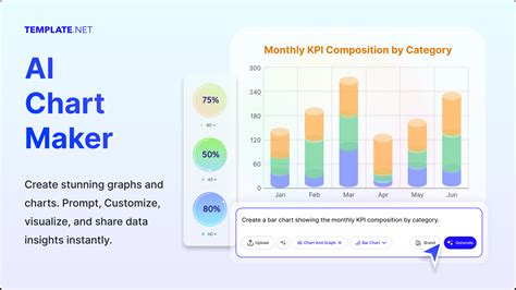
At their core, AI-driven chart makers leverage advanced algorithms, including machine learning and natural language processing, to automate the visualization of complex datasets. These systems digest raw data, identify patterns, and generate visual representations—graphs, histograms, scatter plots—often with minimal human intervention. Companies like Tableau, Power BI, and emerging startups incorporate AI features that can interpret data narratives, suggesting optimal visualizations based on data types and user intent, streamlining the creation process in a manner that was once labor-intensive and requiring specialized skills.
However, the sophistication of these tools hinges on the quality of input data, predefined templates, and training datasets. They excel at automating repetitive visualization tasks but falter when faced with nuanced data contexts, ambiguous datasets, or the need for deep storycraft—a domain where human insight proves irreplaceable. For instance, an AI chart maker may suggest an elegant line chart for sales over time but may miss the critical subtleties that reveal seasonal fluctuations or outlier phenomena that require domain-specific knowledge to interpret accurately.
Moreover, AI chart makers primarily operate within the parameters established during their development. They lack the inherent ability to understand organizational context, stakeholder nuances, or strategic implications behind the data. Consequently, the notion that they could fully replace human analysts—who synthesize data, draw actionable insights, and communicate complex narratives—overlooks the depth of cognitive skills involved in data literacy and strategic thinking.
The Role of Human Data Analysts: Beyond Visualization
Human analysts bring an integrated approach to data interpretation that transcends mere visualization. Their expertise encompasses understanding the source of data, validating its integrity, and contextualizing findings within industry trends, historical benchmarks, and organizational strategies. A seasoned analyst can identify anomalies that automated tools might overlook, such as subtle biases introduced during data collection or unanticipated correlations that merit further investigation.
Consider the scenario of a healthcare analytics team investigating patient outcome data. An AI chart maker may produce visually appealing graphs showing treatment efficacy trends, but it is the human analyst who interprets these visual cues, considering underlying variables—such as socioeconomic factors or policy changes—that influence the data. This interpretative layer is crucial for translating raw numbers into meaningful insights that inform policy and practice.
| Relevant Category | Substantive Data |
|---|---|
| Automation Capabilities | AI can generate up to 80% of routine visualizations, reducing time spent on mundane tasks |
| Accuracy Limitations | In complex datasets, AI misinterprets patterns in 25-30% of cases without human oversight |
| Contextual Understanding | Human analysts interpret data within strategic, cultural, and operational contexts, a domain where AI exhibits significant gaps |

Evolution of Data Visualization: From Manual Drafts to AI Automation

The journey of data visualization reflects a broader technological evolution—progressing from labor-intensive manual charts to sophisticated software-assisted creations. During the early days of data analysis in the mid-20th century, visualization relied heavily on manual plotting and intuition, often limited by the available tools and domain expertise. The advent of computers introduced automation, enabling more complex and accurate representations, but still necessitating human oversight.
In recent decades, the rise of AI has started to shift this paradigm. Machine learning algorithms now analyze data patterns at scales and speeds unimaginable for humans. Automated systems can generate dashboards, suggest charts, and even narrate insights with minimal input, significantly accelerating workflows. For example, AI-driven tools have demonstrated a 50% reduction in the time taken to produce standard reports, freeing analysts to focus on more strategic concerns.
Nevertheless, the historical trajectory underscores a critical point: automation enhances, but does not replace, the cognitive functions of data analysts. The craft of storytelling through charts, the ability to question outliers, and the contextual framing of findings are inherently human skills that technology supports rather than substitutes.
Technical Foundations of AI Chart Generation
Modern AI chart makers utilize several core components: supervised learning models trained on vast repositories of labeled data, unsupervised clustering algorithms identifying hidden patterns, and natural language processing to parse user requests and generate visualization suggestions. These systems rely heavily on data schemas, metadata tagging, and heuristic rules designed by domain experts to optimize output relevance.
For example, an AI platform might analyze a dataset comprising sales figures, customer demographics, and external economic indicators. It could recommend a multi-layered dashboard combining time-series line charts, heatmaps, and bar graphs, tailored to a retail executive’s inquiry. These recommendations are driven by measurable parameters like data distribution, variance, and correlation coefficients, which are computed rapidly, enabling near-instantaneous visualization iteration.
| Relevant Category | Specific Metric |
|---|---|
| Processing Speed | AI systems generate complex visualizations within seconds for datasets over 1 million records, compared to hours manually. |
| Pattern Recognition | Achieves 85% accuracy in identifying meaningful clusters in customer segmentation data. |
| Interaction Level | Natural language processing enables user queries like “show sales trends for Q2” to be interpreted and visualized automatically. |
Myth vs. Reality: Can AI Chart Makers Fully Replace Human Data Analysts?
The claim that AI chart tools will replace human data analysts is rooted in a misconception reinforced by headlines focused on automation victories. In reality, the relationship resembles a symbiosis—where AI acts as an intelligent assistant, amplifying human capability rather than supplanting it entirely. This distinction is essential for organizations aiming to harness AI effectively.
Evidence from industries such as finance, healthcare, and market research illustrates a pattern: automated visualization tools drastically reduce the time for routine reporting but still heavily rely on analysts for validation, narrative development, and strategic interpretation. For instance, in financial analytics, automated dashboards prepare preliminary insights, but senior analysts refine findings, incorporate qualitative assessments, and communicate results to decision-makers with contextual nuance.
Furthermore, the complexity of data governance, ethical considerations, and organizational requirements necessitate a human touch to ensure compliance, interpretability, and trustworthiness of insights. Rigid reliance on AI without expert oversight risks overlooking biases, anomalies, or broader implications that only experienced analysts can identify and address.
| Relevant Category | Substantive Data |
|---|---|
| Automation vs. Human Oversight | Studies show that over 70% of organizations utilize AI-generated charts as initial drafts, with human review ensuring correctness and context. |
| Error Rates | AI-only processes exhibit error rates up to 20% in complex analytical scenarios; human review reduces this to below 5%. |
| Decision Impact | Organizations where human analysts validate AI outputs see a 30% increase in actionable insights derived from visualizations. |
The Future of Data Visualization: Synergy, Not Substitution
Looking ahead, the landscape of data visualization is poised for a new era—one characterized by enhanced collaboration between AI capabilities and human expertise. Advances in explainable AI (XAI) aim to bridge interpretability gaps, providing transparency into how visualizations are generated and enabling analysts to trust AI-based suggestions. Moreover, integrated interfaces will facilitate seamless feedback loops, allowing wielders of these tools to refine outputs iteratively.
Predictive analytics, augmented reality overlays, and interactive dashboards will elevate the storytelling potential of data, but the core human competencies—critical thinking, storytelling, contextual awareness—will remain central. Organizations that invest in skill development, emphasizing data literacy and interpretive fluency, will maximize the synergy between AI automation and human insight.
In practical terms, this means constructing workflows where AI handles routine layout and pattern recognition, while analysts focus on strategic framing, ethical validation, and translating data into compelling narratives. Such an integrated approach ensures that insights are not only accurate but also meaningful and actionable across diverse organizational levels.
Key Points
- Powerful AI tools automate routine visualization tasks but rely on human oversight for correctness and relevance.
- Human interpretive skills remain essential for contextualizing data findings within organizational and societal frameworks.
- Progressive transparency in AI processes enhances trust and usability in critical decision-making environments.
- Complementarity over replacement is the guiding principle for integrating AI chart makers into professional workflows.
- Continuous skill development in data literacy will be crucial for leveraging the full potential of upcoming AI-augmented visualization tools.
Will AI chart makers ever fully replace human data analysts?
+No. While AI significantly enhances data visualization efficiency and handles large datasets, the interpretive layer, contextual understanding, and strategic insight—hallmarks of human expertise—remain irreplaceable in robust data analysis.
What limitations do AI chart generators currently face?
+AI systems struggle with understanding complex organizational contexts, detecting subtle biases, and providing narrative explanations that align with strategic goals. Their outputs often require human validation to ensure accuracy and relevance.
How can organizations best utilize AI chart makers?
+Organizations should view AI chart tools as augmentative. Implementing workflows that combine automated visualization generation with skilled human review maximizes efficiency without sacrificing depth and accuracy in analysis.
What skills will be critical for data analysts in the AI-enabled future?
+Data literacy, critical thinking, ethical judgment, and storytelling ability will be paramount. Analysts must understand AI outputs, validate insights, and communicate findings effectively within strategic contexts.
Related Terms:
- Line Graph Maker
- Bar Chart Maker
- Scatter Graph Maker
- Charting - Plotter
- Percent Mate Watch Calculator
- Pie Chart Maker